Detailed, Somewhat Technical, (Hopefully) Grumperina-Style, Post to Follow
 The planets aligned. The knitting goddesses were smiling on me. Blessings were heaped upon me in the form of Time Alone. That's right -- yesterday afternoon, J took a big long nap. So I used that time to make some serious headway on my first Weasley. I finished the back and bound off across the top. And then I realized that I need to do some planning about placing the initial on the front chest. So I got out my measuring tape, knitter's graph paper, highlighters, and other fun stuff and set to work.
 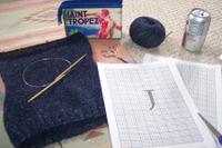 (Note Ineffective Product Placement of Diet Cherry Coke.)
I quickly realized that the whole job would be much easier if I had kept track of exactly how many rows I knit for the back, beginning from the place where I divided for the armholes. Well, now I know for S's Weasley. So I drew out the front on graph paper, including the shaping for the neck, and I realized two things. (1) My row gauge is a little off, and (2) I have probably just enough room to fit the initial on the chest before I have to bind off for the neck. Briefly considering ripping back in order to start initial before the division for armholes. Thought to self, What? Are you mental?! Decided to make initial a little smaller.
Then I decided that I really, really, really did not want to have to rip the front later after realizing that my initial just doesn't look right.
 Also considering my lack of experience with color knitting, I thought I'd better practice on a swatch first. First, let me say that my tension here is just a little wonky. I stranded across the back (intarsia makes no sense when it is generally only 3 sts wide) and that made the letter pucker up and sort of stand in relief. That's actually kind of cool. But the whole thing looks more than a little amateurish. Maybe that's OK. If it looks like an authentic Mrs. Weasley creation, then my amateur status is working for me.
Also, I'm not sure about the design of the letter.
 I created my chart using the method that Alison suggested on the blue blog, using the Lumos font, which you can find here. I love the antique-y, slightly magical look of this font. It is awesome in print. I am not so positive about how it translates to knitting. Mi Esposo thought that the bottom tail of the "J" ought to curve up some more. I was afraid it didn't look like a "J" at all, but rather a turkey baster or syringe or something. So I asked Little Guy what it was, and he said "J for John." So far so good. I'm slightly inclined to work it as is, but I'd like some other opinions. So, more curve at the bottom or no?
posted by Laura at 12:56 PM
![]()
![]()


3 Comments:
You know what? If the recipient knows what it is, I think it's perfect! What a sweetie. :) (Sort of like when I made a little firefighter jacket for A's Halloween costume. He took one look and said, "Wow, Mom. That's a cool firefighter's jacket!" And he's only two.) We are blessed with grateful sons. *grin*
I agree that if John knows what it is, it's not a problem, but if it were me, I'd probably give the tip of the J a little more hook. Maybe even just flattened out a little--not necessarily scooping back up again. It's such a beautiful letter in that font!
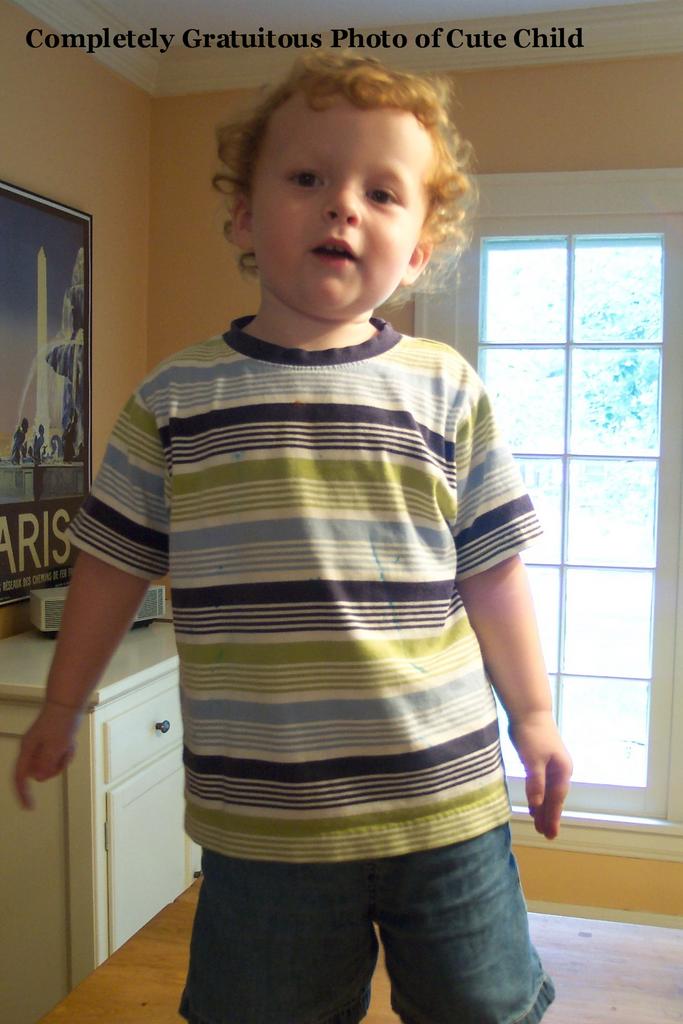
What a cutie!
Post a Comment
<< Home