More Weasley Issues
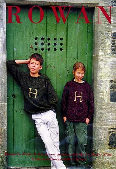 OK, if I had actually looked carefully at the other photos from Alison's site, I would have noticed that in the original Weasley sweater, the initial is (1) quite large and (2) centered right in the middle of the front, partially over the stomach. Here's Katia's J-Weasley, all finished. That looks amazing. She also used the Lumos font for her chart, but as she did it with the right size and placement, she avoids the issues I just posted about. Short of doing a lot of frogging, my Little Guy's sweater is not going to look like the originals.
{Taking a moment to breathe. In. Out. In. Out.}
I am very tempted to let go of the desire to make a Weasley that is like the Rowan original in every detail. After all, it will still be a very nice sweater. Right?
Also, other people seem to be doing the letters in intarsia. Is that because they are bigger? Questions, questions, questions.
posted by Laura at 2:44 PM
![]()
![]()


2 Comments:
So, I think Katia's "J" looks amazing (and it has a pretty straight tip, too). But I also think that yours might be more challenging because of the smaller size? I have not had the opportunity to chart anything, yet, but still am a little terrified about getting the scale/gauge right . . .
It's your sweater! If kiddo knows it's a "j" with no prompting, then it's a "j"! I think it will be great. It looks really cute so far. Gee, you could even do it in duplicate afterwards if it would save you some headache of counting rows! :)
I do think I need to read up on the difference between stranding and intarsia, though. I'm not really getting what the issue is . . . *blush* Sorry to not be of more help. --Amanda
I don't know, I don't know. Go with what you think...a little ripping we have all done. I know nothing about intarsia...I am hoping to take it in the winter!
Post a Comment
<< Home