On the Sidelines
Yep, I wimped out of the Knitting Olympics. I thought about doing it with no intention of actually trying to "medal." But, then, where's the fun in that? And if I signed up, I'd feel compelled to work only on the mittens and neglect my Backyard Leaves and Nautilus, even if I had no reasonable expectation of finishing on time. I'll be cheering you all on, though!
But I am going to knit the mittens. I think it might be a good idea to do a little something smaller in stranded colorwork, before I try to knit The Sweater Vest.
Here's where I'm a little stumped. Which contrasting color should take center stage, the wine or the teal?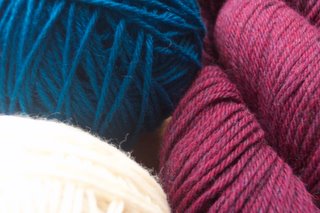 Or am I insane to think that these colors work together at all, in which case I should choose a two-color pattern and throw one of these colors back to the stash? (Do not be afraid to say, Laura those colors are hideous together. I will not be offended in the slightest. I will say they look a little better together in person.) By the way, the pattern is Mittens from Lapland, from Folk Mittens.
Also, when the designer says that I am going to knit this worsted on size 2 needles, does she mean size 2 needles?! Zoinks! I used size 9s and this yarn on Kepler.
But I am going to knit the mittens. I think it might be a good idea to do a little something smaller in stranded colorwork, before I try to knit The Sweater Vest.
Here's where I'm a little stumped. Which contrasting color should take center stage, the wine or the teal?
Or am I insane to think that these colors work together at all, in which case I should choose a two-color pattern and throw one of these colors back to the stash? (Do not be afraid to say, Laura those colors are hideous together. I will not be offended in the slightest. I will say they look a little better together in person.) By the way, the pattern is Mittens from Lapland, from Folk Mittens.Also, when the designer says that I am going to knit this worsted on size 2 needles, does she mean size 2 needles?! Zoinks! I used size 9s and this yarn on Kepler.
posted by Laura at 12:05 PM
![]()
![]()


18 Comments:
I like those colours together...it's amazing what looks good when you put them together. I have Trinny and Susannah's book (the BBC 'What Not To Wear' women), and they have a whole section of colours that go together, and I think they have that exact combo.
I like the wine colour as the more dominant one, but that's just me...
Hmm, I had wondered about knitting worsted weight yarn on size 2 needles. A lady from my SNB was knitting an entire sweater for her husband on size 2 needles (to which I asked if he was actually pygmy sized to make that a more reasonable endeavor... hmm, maybe that was a bit offensive) and I think she said that the intent is to make a really DENSE fabric that's basically water repellent. HMM, great for mittens, not so sure about on an actual garment. Anyway, I think it'll turn out wonderfully in that gauge.
As for the colors... I do actually like them side by side. I think teal should be the main color and the wine the contrasting color.
I'd vote for the wine to be center stage. I think the colors look nice together.
The colors look fine. I would wither just pick the color I liked best to be dominant or I would swatch several choices and choose what looks best. - Well I wouldn't swatch - but I'm just lazy!!
I like those colors! Whichever one you like the best should be center stage. I think either one would work.
I like those colors together too. I would go with the wine for the dominant color . . . but either way will look good. I guess it's just a matter of personal preference.
I have to admit, the colours gave me a shiver when I saw them together in the first picture. But then I scrolled down and saw the aspired object. What a surprise that they work together. Or maybe not, I am not good with colours - they usually come out of the skein ;-)
If, after this embarrassing statement, I still qualify for any suggestions, I would have the wine the more dominant. The smaller needles definitely improve water (and wind) repellent features. The gap between your 9 and the suggested 2 seems a bit strange, though. Swatch!
I love the colors together. I agree that the wine color would be beautiful as the dominant. Gotta run home and check my copy of Folk Mittens to see which one you're doing. I love that book.
I love the colors together, and I, too, say the wine should be dominant, (shouldn't wine always be dominant?), and the teal the "highlight"
Go Laura!! I´m in too..
Looks like my Zen-like channeling of Grasshopper worked! ;-) Just kidding. I was actually kind of hoping in the back of my mind that you'd go for it, but if you're doing the mittens anyway, then it's all good. We can be spectators together and walk around Olympic Village looking for all the best places to eat since we're not in-training! I really like those colors together! Maybe I'm just weird (Maybe? "just?"), but I kind of like the teal for the dominant color. I think either way would well, though. Take care, Laura! :-)
I bet you could find a button/team for that...
I like those colors and I think Margene is right (although, I always think Margene is right...) and you should do a swatch to see how the colors work up together
Trust me, you're not the only one staying on the sidelines. I came to the conclusion that I value my sanity a bit more than I value my ability to meet a challenge, but I'll of course still be cheering all the participants on.
Also, I love those colours together and my vote is for the teal. It could just be my monitor, but over here it's the most vivid colour and is going to stand out quite a bit regardless. You may as well put it in a position where it's not competing for attention.
Worsted on size 2s is doable, just not a whole lot of fun, at least with Sugar n Cream. I'm guessing it's easier with wool.
I think the wine would be a better main colour because the teal is darker and it'll jump out at you regardless
I like the blue dominant - those colors do go together beautifully. If you have to look at the photo a lot, though, I'd imagine using red dominant might be less confusing. So pretty! Ought to be very warm & wind-proof, dense mittens. I think I'll just knit a swatch with worsted on 2s just for the sake of curiosity, now. Bless!
-meg (inchbyinch.blog-city.com)
I like those colors together too!
I think the colors look, good together -- also, there is BLUE, and you know how we at Ackery feel about BLUE. Nevertheless, I think I'd go with wine as the main and blue as the accent.
As for the Knitting Olympics, I still think you're going to post in the next couple of days saying, "I know signups have closed, so I'm just going to do this on my own, for the love of the game." You know you want to. Heee!
size 2 on worsted? what tight weave those will be the warmest mittens EVER :) the colors are great together go with them !
Post a Comment
<< Home