The Proof Is in the Swatching
"Swatch it" is of course excellent advice, and with my trepidation about size 2 needles, it was a given. Both Eunny and Juniper made the point that the teal is quite vivid and contrasts more highly with the cream. Therefore, it might be better to make that the main contrasting color, since it's going to be screaming for attention. That made some sense to me, so that's the first swatch I made, on 3 mm needles.
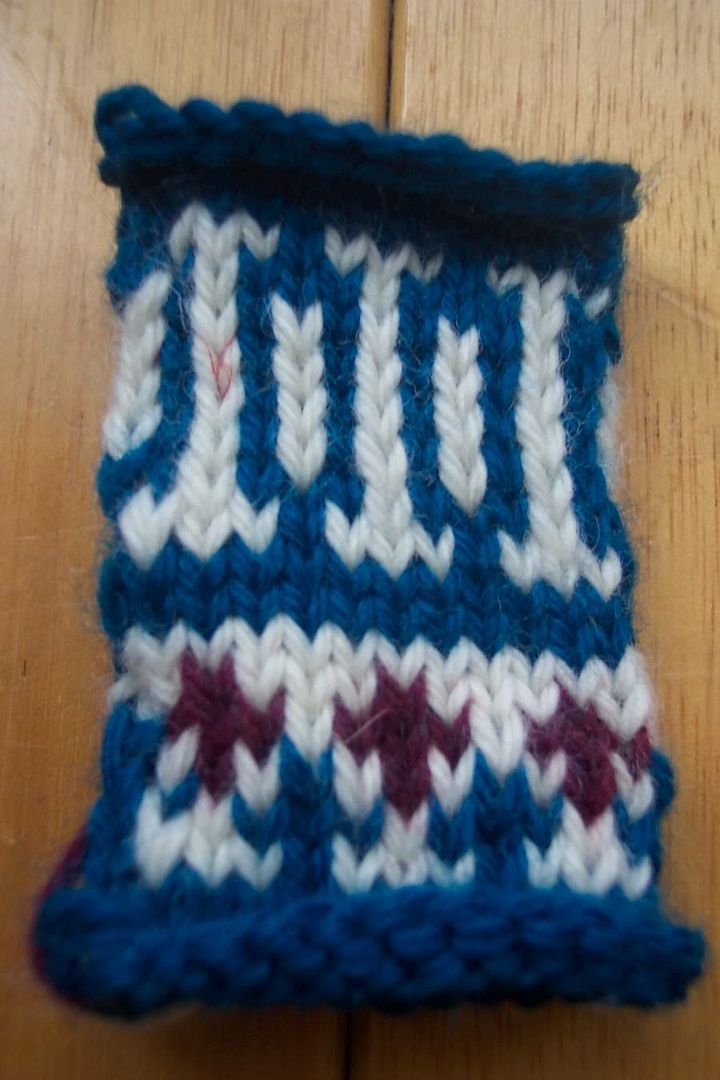 I really thought as I was working this swatch, that this was going to be the winner. The gauge seems to be slightly off, on the small side. The designer must be the loosest knitter ever. You know what I mean.
Next swatch, 3.5 mm needles. This time, wine takes the center stage. I wasn't really sure about it, so I knit a little more in teal at the top of the swatch. 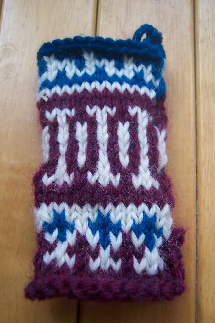 Gauge is a slightly big on this size needles, but I'm going with the 3.5 mms. As Elizabeth Zimmermann famously said, "Nothing is horrider than a tight mitten." But the color scheme? I don't know! This one looks pretty good to me, too! I was expecting the teal to jump out in a most impertinent and unattractive manner, but actually, it doesn't.
Considering this is my first attempt at all-over stranded colorwork, I'd say it's not bad. My stitches look okay, but note that the tension is wonky, particularly where I am changing colors on alternate stitches. Helpful tips from the more experienced are always warmly received.
By the way, Catherine ... you are right. These will be possibly the warmest, densest mittens ever!
posted by Laura at 3:16 PM
![]()
![]()


21 Comments:
The best advice I got for stranded knitting was the frequent stretching of floats. So every 5 stitches or so, take the last 5 stitches you've worked and spread them out on the needle pretty far. You might worry that it will make the floats too loose, but I found that it really helped keep everything totally even.
If it matters, I think i prefer the one where the wine is the main color and the teal is the accent, but go with your gut!
Pretty, pretty. My colorowork experience is limited to half a potholder from my FI class. But I think your swatches look great. I like the dominant wine better, but it is just personal preference. Either way, they will look great. They will definitely be warm. We'll have to start calling you "Ole Sweaty Hands."
I like the wine as the main color, although both swatches look great... your mittens are going to be so warm!!
Amanda
I too, like the wine as the main color - I like those hints of teal in there!
I think I kind of like the second one best. It's richer and more subtle. The top one looks a bit more typical.
Well, just to mix things up a bit (because more people seem to be leaning toward the wine)...I like the teal better as the main CC! And I didn't think I would, because wine is my favorite color (I'm wearing it right now). I think the wine accent just pops more on the blue and white background, than the other way around. But both swatches are really lovely! I, like Christine and Sonya, am still rather trepidatious about colorwork.
Very pretty! I have no advice as I haven't attempted intarsia or fair isle. Both combinations are appealing. I say go with what strikes you as most attractive.
Those are going to be very, very nice. I have to vote for the teal. I think the little flecks of wine just look so incredible in that swatch. In the other swatch, the teal flecks in the wine body get a bit lost. But that's just my first impression - I think they will look great either way.
I like both your swatches. The colors are great together! But I think I like the teal one best. But that's just me! I think whatever you choose is going to be great! MWAH!
Sorry no help here. I like them both!
Maybe you could do like in the second swatch and switch up the contrasting colors?
Oh whoa, the wine is a *lot* darker than I thought!
Hmmm......what would it look like with the white as the CC, I wonder.
Putting my vote in for the wine as main CC. If you're worried about your floats being too short and pulling the fabric in, you can always knit them inside out, so that you are working on the back needle and the public side of the fabric is inside the mitten while you knit. Does that make sense? The only fair isle I've done was a pair of socks for my MIL, and if I had them to do over, I would've worked them inside out (they ended up a little tight.) They are going to be beautiful mittens no matter what!
I like wine as the main color. I have no advice for you on stranded knitting, as it is way beyond me right now. I find your swatches impressive to say the least.
Though I know this was not the point of your post (obviously), I have to tell you that your line about the loosest knitter made the seventh grader in me giggle uncontrollably. ;-) Too funny! Your swatch looks really beautiful- you're like an old pro with all this colorwork! So impressive! I'm no help either, since I think either way would look really nice....I'm leaning slightly toward the teal, but honestly, the wine is just as pretty. Take care, Laura! :-)
I like the teal (the second one). When I saw your post yesterday I would have said that the wine needs to be in greater proportion than the teal, because the teal will grab your eye more, even in a small amount. But seeing the swatches, this isn't the case.
Hi Laura I'm your Sock Pal for the Sockapaloooza Exchange! Looking forward to making your socks and learning more about you from your blog! :o)
if the swatches look that good, i am really excited to see the mittens!
Another vote for using the wine. The teal just looks too bright to me. I thought wine when you first posted about it (but didn't comment) and now I'm convinced.
Of course the fact that I like reds and pinks makes me a little biased.
Both look so great. It's amazing both swatches are the same yarns just different order. Hard to choose!
I think I lean towards the wine one.
I like the 2nd one :o)
Post a Comment
<< Home